
Is a Picture Worth of Thousand Words?

Effective Example:
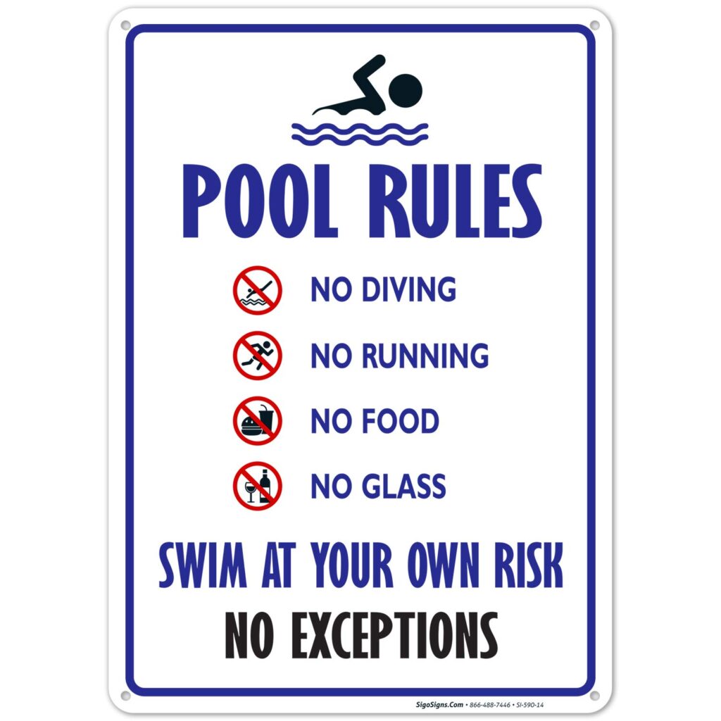
https://images-na.ssl-images-amazon.com/images/I/717si1BWeUL._SL1500_.jpg
Ineffective Example Link:
https://dryuc24b85zbr.cloudfront.net/tes/resources/11401360/image?width=500&height=500&version=1479719949989

“A picture is worth 1,000 words” is the same as saying “knowledge is power, where knowledge resources are unlimited” (Laureate Education, 2010d). Learners can only see traditional views unless development or self-directed learning seeks additional forms of literacy to make sense of the picture or knowledge (Laureate Education, 2010d). Understanding information is contingent on the learner’s internal motivation, learning direction, prior knowledge exposure, and recall of data to working memory (Laureate Education, 2010d & Mayer, 2014, p. 86). In conclusion, for a picture to be worth any words; or knowledge to be considered any valuable form of power, the learner must cognitively process the multimedia-instruction in working memory STE, store relevant bits in long-term memory LTE, and effectively communicate the new knowledge.
The human information processing system or STE is limited in capacity by cognitive load storage (Laureate Education, 2010b). Effective use of graphics in instructional design can help reduce the cognitive load in STE by relating depicted imagery with relevant LTE, eliminating processing time. An example of the effective use of graphics in instructional design is illustrated in the Pool Rules sign.
Meaningful learning is the result of two multimedia instruction goals: remembering and understanding (Mayer, 2014, p. 21). The graphic showing the pool rules adhere to the integrated comprehension of text and picture theory ICTP. In the broader framework of human cognition, the graphic has semiotics to visualize the textual description (Mayer, 2014, p. 83). The symbol used in the graphic is the universal symbol consisting of a circle with a backslash through the middle. The use of red color for the vector recalls LTE relevant to sensory input: Green means go, yellow means slow down, and red means stop. What makes this symbol so effective is the ability to instantly trigger visual sensors relating new information as prior experience with the color directions of a traffic light. Active processing of LTE and new information in STE learners apply generalized prior knowledge as automatic metacognition, easing the strain on cognitive load (Laureate Education, 2010c) The icon inside of each “universal no sign” furthers comprehension of the specific line of text with a fast recognizable image through effective white space or spacial proximity. The typography is designed with a visual color system to form information hierarchy.
An example of weak use of graphics in an instructional setting is demonstrated in “how to brush your teeth.” The images do have relevance to the content in the photographic learning process. However, the spatial correlation is not directly connected to the subject text. The image’s meaning and purpose are to help further cognitive processing. However, the images do not require me to think further than what is being visually processed. In my opinion, in order for a graphic to have a practical instructional purpose is to use the “squint” test. Squinting your eyes helps blur the body copy, leaving you with the main points needed from that instructional piece. If the learner can not tell the subject matter of the information from vectorized text headings, combined with the images, there is a missing link in the design process. With the “how to brush your teeth” image, the main design flaw is information hierarchy represented in the textual description is not visible. Adjusting line spacing, size, and style of the existing text applying one graphic and one
In my opinion, the graphics are purposeful by using multimedia learning theories. These design approaches generate meaningful learning through depictive learning. As an instructional designer, graphics should be purposefully used to stimulate visual imagery relevant to the textual description but allows further understanding through cognitive activity (Laureate Education, 2010e). The graphic’s size, color, and resolution provide guidelines, media outlets, and any complications to instructional designers. The use of rasterized, or vectorized graphics can display differently for computer-based screens, and printed material (Laureate Education, 2010b). Instructional designers need to understand the audience to determine if vectorized images can be used in replacing photographic pixel images without losing the validity of newly presented knowledge.
Resources:
Laureate Education (Producer). (2010b). Introduction to graphics [Video file]. Baltimore, MD: Author.
Laureate Education (Producer). (2010c). Multimedia learning theory [Video file]. Baltimore, MD: Author.
Laureate Education (Producer). (2010d). Technology-centered vs. learner-centered instruction [Video file]. Baltimore, MD: Author.
Laureate Education (Producer). (2010e). What is multimedia? [Video file]. Baltimore, MD: Author.
Mayer, R. E. (2014). The Cambridge Handbook of Multimedia Learning (2nd ed.). Cambridge University Press